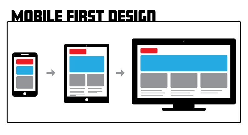
With 5 billion users using mobile phones (see source), it should come as no surprise that mobile first design has increased and surpassed the importance of desktop design. What is mobile first design? It is a design strategy that starts first with sketching and designing for the smallest screen first (mobile phone), then progressively moving your way up to the largest screen. The sequence would be to first design for a mobile phone, then tablet, and finally desktop (or larger screen). This forces the UX/UI designer to prioritize both function and content. It also creates a more consistent experience for your users across all devices.
This kind of design is known as progressive enhancement. Designing this way focuses on the core content. You are forced to concentrate only on the essential elements and content while making sure your users access that information in a straightforward and efficient way. Here are some articles on progressive enhancement from Lifewire, Smashing Magazine, and FreeCodeCamp.
The opposite of progressive enhancement is graceful degradation. Graceful degradation is when a designer starts with the largest screen (such as desktop) and then works their way down to the smallest screen, cutting out features or functionality. It makes more sense to take a progressive enhancement approach when designing. By starting with the hardest device to design for (mobile phone), it becomes essential to build a stable and functional system using the most basic web technologies. Anything extraneous is eliminated. Once this solid foundation has been established, more technologies and complexities can be added as bandwidth allows and the screens get larger.
Mobile first design also helps with establishing breakpoints. Breakpoints are:
-
From a coding perspective, a breakpoint is a media query. A media query is an HTML/CSS functionality that allows the content of a Web page to adapt to the type of media that the page is being rendered in, such as a computer screen or that of a phone or tablet. (see source)
-
From a design perspective, it is the point when you make a change to the presentation of your content. (see source)
Designing mobile first establishes the first breakpoint for smaller devices such as phones, which become the default. From there you can create content specific breakpoints for larger screen sizes.
In 2011, mobile phone sales surpassed desktop sales (see source). Then in 2016, mobile usage surpassed desktop usage (see source). We are spending more and more time on our phones and less time on our desktops. Our design priorities have to change to reflect this shift. This means cutting out anything superfluous and just focusing on the content and functionality that mobile users want.
Last year, Google started rolling out mobile first indexing. This means Google will predominantly use the mobile version of the content for indexing and ranking. Mobile-friendly content will perform better for those who are searching on mobile so it would be beneficial to have your site mobile-friendly.
Here are a few tips to keep in mind when designing mobile first:
-
Keep it simple. Navigation, functionality and design should all be simple and easy for users to use and navigate through the site.
-
Don’t use large graphics. Large graphics don’t display well on small screens and users will have to zoom in to look at details. Large or complex graphics also take longer to load.
-
Create a content hierarchy. Users are scanning content. Decide what content is most important and display it more prominently.
-
Use buttons. Use buttons instead of text links and make sure the buttons are sized large enough to accommodate fingers of all sizes. Err on the side of larger rather than smaller.
-
Test on a real device. Actually several devices, both iPhone and Android if possible. Also view on older devices as well as new devices.
Designing mobile-first is a design strategy that will help you optimize and get the most out of your site. As our mobile phone usage continues to increase, we have to adapt our design strategies so that users can get the best mobile experience out of your site.