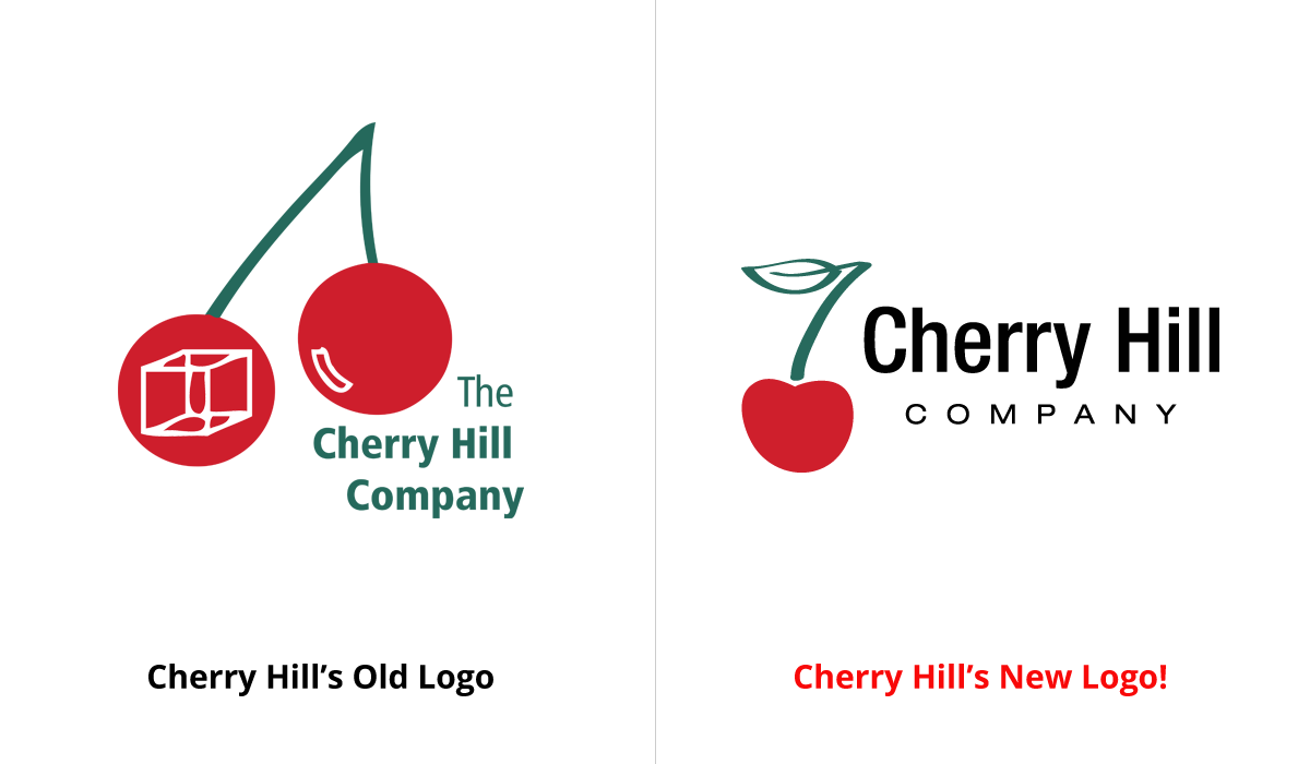
You might have noticed that we have a new logo! And if you didn’t notice, take a look above and compare our old logo with our new, modern and classy logo.
Why we decided to rebrand
The old Cherry Hill logo had been around since the inception of the company (1995) so a logo overhaul and rebranding was long overdue. I joined the company in April 2015 and the first thing I wanted to do was redesign the logo. I thought the old logo wasn’t representative of the company and frankly, I didn’t understand it. I wasn’t sure what the white box in one of the cherries stood for and no one at the company could explain it to me. Not a good thing. If your own employees don’t even understand what the company represents or stands for, how will others? A company’s logo is not only its brand, but its identity too. It is the single most important piece in a company’s branding. But alas, client projects which are always our priority, kept me busy but the thought of wanting to redesign the logo never left me.
How the redesign came about
I was gently warned by a previous employee that Cary (our Founder) was very attached to it and would not be open to changing it. But to my surprise, when I brought up the subject of a possible Cherry Hill logo redesign to Cary, he was open to it and encouraged it. He was not at all attached to the logo and gave me full reign, a designer’s dream! With Cary’s blessing I made time to redesign it, working on it at any spare moment.
The process
I knew what I wanted to convey with the new logo. I wanted a more modern and “clean” look that represented more of what we do. I also wanted it simple and flat, without any bells and whistles. No gradients or effects. I wanted the logo to be timeless and one that could be easily applied to all sorts of media and applications. After several days of sketching ideas, I executed 16 different logos. In my logo exploration, I created all kinds of logos. I wanted a simple, flat logo, but I still designed some with gradients, depth, texture, and dimension. I wanted to be sure my logo exploration explored all possibilities, not just what I wanted. From the 16, the Cherry Hill team decided on four finalists. The four was then narrowed down to the final 2. After a couple more rounds of revisions and input, we selected our final logo which is the logo you see today.
Do you like our new logo? Leave a comment and let us know what you think!
And stay tuned, we will be launching our new website soon!